The Human Behind the Data Curtain questions the commonly perceived dichotomy between subjective and objective data visualization and argues that almost all data visualizations contain some degree of subjectivity: as manifestations of the creator’s imagination, they represent their own preferences, values and biases.
Being conscious of this can help a designer to take steps to minimize subjectivity when the goal of the visualization is to present information as objectively as possible. Objectivity need not be the only goal of data visualization, however. Embracing subjectivity and exploring ways to represent nuance, imperfection, and emotion in data visualizations can help us navigate the massive quantity of data that is available to us in today’s information age. Emphasizing the personal stories in data visualization will encourage a larger audience to expand their understanding of the data that surrounds them and to recognize both its limitations and its possibilities. It will help us to value the human qualities that technology can’t track, and it will teach us to notice when a presentation of data tells an incomplete, biased story.
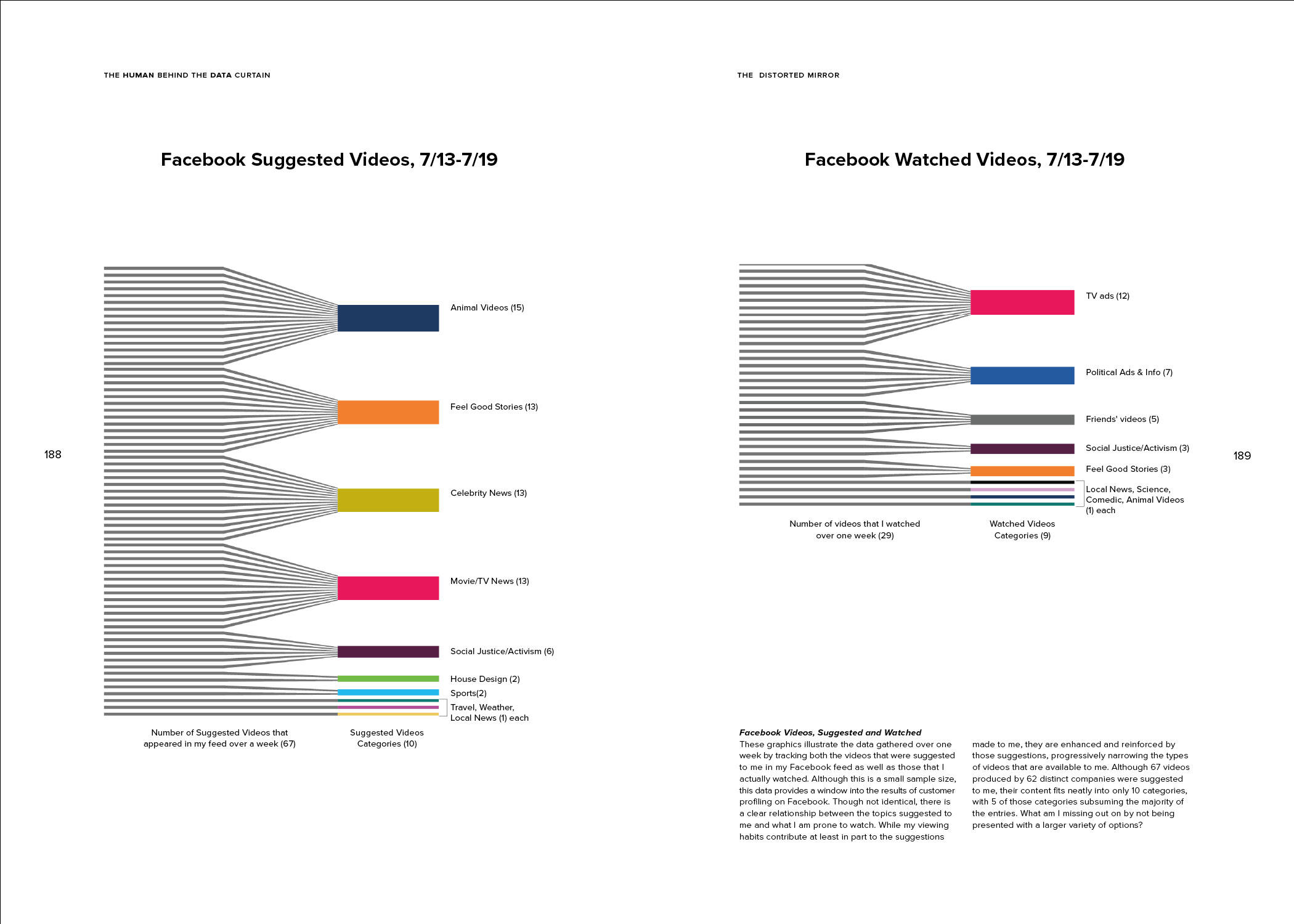
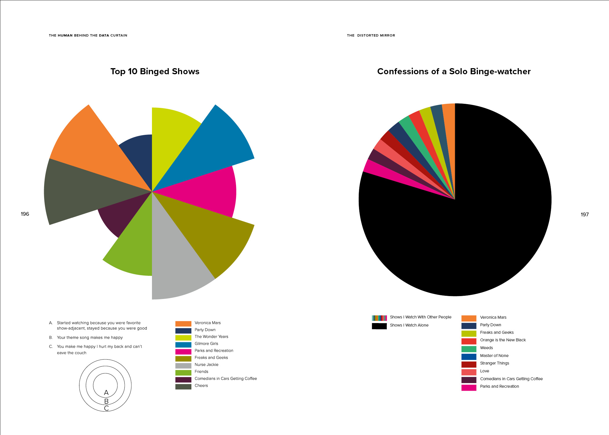
These skills are becoming increasingly important for the everyday user as the amount of data that is being collected about us and our behaviors is growing every day, and more and more of the information and opportunities we are offered are dictated by algorithms based on this data — from our Netflix and Amazon recommendations to whether we qualify for a loan. Can data, and the algorithms that are built from them, successfully tell a nuanced, imperfect and human story? And how will our lives be affected if they cannot?


